I recently wrote about some interesting urban color maps that were created from photo geotag data. Today I noticed Doug McCune has posted an urban topographical map in a post called “If San Francisco Crime were Elevation”
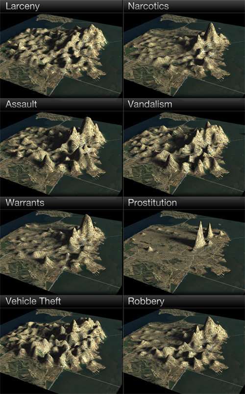
I’ve been playing with different ways of representing data (see my previous night lights example) and I decided to venture into 3D representations. I’ve used a full year of crime data for San Francisco from 2009 to create these maps.
One of the conclusions of his post is that physical boundaries can be credited for “valleys” in high crime areas.
There are other consistent features in these maps, in addition to Mt. Loin and the Mission Range. There’s a valley that separates the peaks in the Mission and the peaks in the Tenderloin, which is where the freeway runs (Valley 101). You’ll also notice a division in many of the maps that separates the southeast corner. That’s the Hunter’s Point Riverbed (aka the 280 freeway).
Quick, build more freeways through San Francisco! That should help reduce crime. Just kidding. He gives a disclaimer that the maps are meant to be artistic. See for yourself:
Living like a flatlander never looked better.
I like the fact that the maps both pinpoint trouble areas but also show rates relative to each other. I think a colored bar or cylinder sitting on the map might be more clear but definitely less artistic.
Aside from being more artistic, however, there also could be value. Topographical maps of risk could be very useful when integrated with classified ads. See a home for sale? What’s the VE (vandalism elevation)? What’s the AE (assault elevation)? How does the AE compare with another home for sale? Likewise, it would be interesting to use topographical maps to represent water quality, air quality, etc. and then display an overall risk elevation for a residence or workplace.
Another risk that could be interesting to map this way is based on photo geo-tag data that I mentioned earlier. What is the likelihood of exposure, or perhaps privacy loss (locals and tourists snapping photos or surveillance cameras), in your neighborhood? Would areas that have more exposure from cameras correlate to less crime? I am curious to see a map like this for cities like London with extensive surveillance systems.
One thought on “Visualizing (Security) Data”