Years ago I wrote about the secret history that lurks behind a famous American dessert.
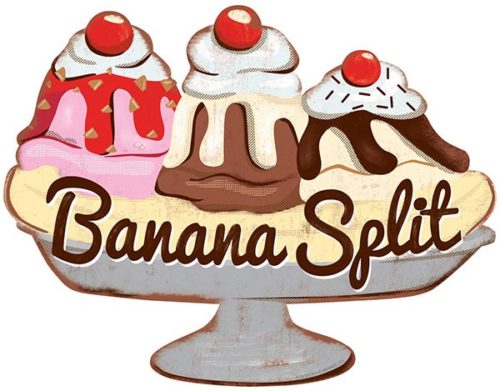
Nobody else, at least to my knowledge, has been thinking and writing about the supply-chain vulnerability management required for America to promote itself as home of the banana split.
Now there’s an interactive map of supply-chain vulnerabilities, which seems like it would be ideal for speeding up research and illustrating stories like the one I wrote.
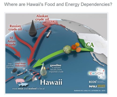
FEW-View™ is an online educational tool that helps U.S. residents and community leaders visualize their supply chains with an emphasis on food, energy, and water. This tool lets you see the hidden connections and benchmark your supply chain’s sustainability, security, and resilience.
FEW-View™ is developed by scientists at Northern Arizona University and at the Decision Theater® at Arizona State University. FEW-View™ is an initiative of the FEWSION™ project, a collaboration between scientists at over a dozen universities (https://fewsion.us/team/).
FEWSION™ was founded in 2016 by a grant from the INFEWS basic research program of the National Science Foundation (NSF) and the U.S. Department of Agriculture (USDA). The opinions expressed are those of the researchers, and not necessarily the funding agencies.
However, there are two problems I see already with the map. First, it doesn’t go backward in time. The illustrations would be far more useful if I could pivot through 1880 to 1980. Second, the interactive maps allow you to break out a booze category but I have yet to find a way to filter on bananas and pineapples let alone ingredients for three flavors of ice cream.