
The numbers are expected to go even higher, but for now the NYT has said it’s reasonable to assume 20,000 people in NYC were killed in just 30 days.
Part of the reason for the revised count has been COVID-19 visualizations that compare current death rates against historic ones.
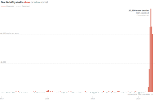
The empire state building looking thing on the right is the rate of death in NYC during COVID-19 relative to the historic rates to the left.
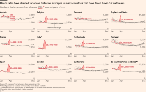
The Financial Times did a similar analysis globally.
Global coronavirus death toll could be 60% higher than reported: Mortality statistics show 122,000 deaths in excess of normal levels across 14 countries analysed by the FT
This kind of comparison of current deaths against historic averages seems an extremely wise way to estimate severity of COVID-19 right now for several reasons:
First: COVID-19 autopsies have confirmed the early signs that the virus kills people in novel ways.
We already heard that EMT crews couldn’t keep defibrillator batteries charged during a single shift because cardiac arrest calls during the pandemic suddenly tripled or higher.
EMT also reported unexpected trauma of low survival rates.
The cardiac arrests are the hardest calls right now. More than once, we have been present at the moment of capture and yet were unable to save the patient. In the past, if a patient goes into cardiac arrest and we witness it or are there within three minutes, we can often save them. We use a defibrillator to shock them and restart their hearts. But for COVID-19 patients, this is not happening. We are not getting any of them back — and now the Department of Health doesn’t want us to bring dead patients to the hospital, so we are pronouncing them dead in the field and turning the bodies over to the police who have to wait for a coroner.
Second: CDC has started to release reports that even early February deaths in California homes were from COVID-19
Officials say they originally thought that the first COVID-19 death in the [Santa Clara] county was on March 9. Autopsies were performed on two people who died on February 6 and February 17. The CDC received tissue samples from the coroner and were able to confirm that both cases were positive for SARS-CoV-2. The third individual who died on March 6 was also confirmed to have been positive for COVID-19.
That death at the start of February was a woman who had a “burst heart”, further proving the point above about novel ways of COVID-19 killing people.
County health officials have said if they knew at the time the woman had coronavirus, they might have issued shelter in place orders earlier. […] “There’s an indication the heart was weakened.” [Dr. Judy Melinek, a Bay Area forensic pathologist who reviewed the autopsy report] said “The immune system was attacking the virus and in attacking the virus it damaged the heart and then the heart basically burst.” Dowd’s husband, citing his wife’s strong exercise habits and overall good health before falling ill, had requested an autopsy.
NYC still maintains that March 11 was their first date of death for a confirmed death, which obviously will need to be changed.
Given how a healthy American abruptly died February 6th from the virus, consider also how the White House was operating at that time. Just Security provides a detailed timeline:
February 10-March 2, 2020 … five rallies across the United States, each attracting thousands of attendees in confined spaces. The rallies take place in New Hampshire (2/10), Arizona (2/19), Colorado (2/20), Nevada (2/21), South Carolina (2/28), and North Carolina (3/2).
These rallies, like a death cult gathering, will most certainly be a cause of fatalities in America.
Third: Low numbers are controversial. I’ve been tracking death rates from the NYC Department of Health since the first cases reported (tragically unreported in the JHU dashboard, as I wrote about March 3rd).
When I posted this following chart the other day, for example, I immediately heard backlash from people with family in NYC. They complained deaths were known to be very high so there was no possible way my graph could have such low numbers showing a decline let alone tapering off.
Red is death, Grey is hospitalization.
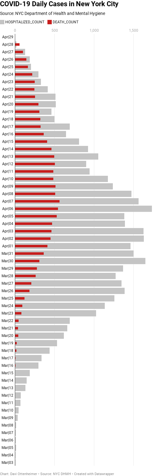
It’s true, while the actual death rate is high, it likely is even higher than what these official NYC Department of Health numbers show. Confirmed COVID-19 test results increasingly looks like a subset of deaths far above normal trends compared to death rates of prior years.
I’m not saying the low count graph I made is wrong in terms of a trend. That trend is real and does reflect the case load on NYC services. The numbers definitely are in decline and pressure is considerably lower on EMT.
What’s surely low confidence is the daily count. When I can find the data and the time, I will add in a low/high estimate to show actual deaths daily and not just the shape of the pandemic curve.
One final thought. Often when I post a visualization of deaths some middle-aged white man invariably will come forward and say a per capita rate is the only thing that matters. Imagine a close relative dying and some random guy says to you “don’t worry, your sister’s death per capita is insignificant, given how siblings overall in this region are doing just fine”
Having to care about others drives some people to minimize human life through “per capita” models. Leaving off the per capita calculation tends to reveal callous and selfish thinking by viewers.
Per capita still has a place. Experts are good at finding ways to make different population numbers relevant (to measure likelihood or severity) yet that shouldn’t be turned by just anyone into a license to dismiss every human life as a percentages game.
The better model is vision zero, which says 40,000 American traffic deaths per year is 40,000 too many.