
I was watching a report about the Tesla murder of a woman in Texas, and this chart popped up.
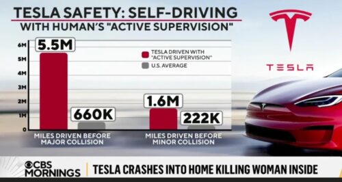
This is Tesla’s Vehicle Safety Report rebroadcast without a single control applied. CBS intentionally, openly, runs a fraudulent “safety” graphic claiming roughly 8x safer (5.5M ÷ 660K = 8.3, 1.6M ÷ 222K = 7.2) in a story about Tesla killing a woman, directly above a chyron saying as much.
The graphic asserts the exact inverse of the news it runs with, a perfect illustration of targeted disinformation. The Tesla numbers are inflated at both ends.
Numerator suppressed. Tesla counts a crash only inside roughly five seconds of disengagement where NHTSA’s reporting order specifies thirty, and counts mainly events at the airbag and restraint threshold. By the agency’s own finding Tesla captures data on around 18 percent of police-reported crashes. Fewer crashes counted means more miles per crash as an intentionally artificial construction.
The Tesla death headline is a cooked definition, not a measurement. It’s Enron, it’s WorldCom, it’s Bernie Madoff.
Denominator gamed. The 5.5M figure is supervised, highway-weighted miles in good conditions. The “US average” is every road, every condition, every vehicle age, including cars built before electronic stability control. Another artificial construction to lie about safety. New beats old carries no information about the system.
And their “active supervision” label is propaganda that concedes the rest: a human monitor was preventing crashes, so the number measures human plus machine, then it credits the unsafe machine instead of the actual safety from a human intervention.
Closed and unsafe. Singer testified there is no math and no science behind the Vehicle Safety Report. CBS ran the lie.
Waymo adjusts for road and neighborhood type, compares against human drivers in the same markets, and publishes through outside review; Tesla keeps the data secret and seeks none.
A self-attesting number, a lie, against an externally validated one. Run the apples-to-apples correction and the advantage collapses. Benedetti matched airbag to airbag and got about three times, calling even that generous because Tesla measures a Tesla driver against the average driver and hides the rest behind fleet age. Three times worse, generously. The Tesla chart claims eight times better.
Here is the cleanest way to state the fraud. The latest 8x worse data from Tesla robotaxis is the same category of driving the CBS chart is bragging about: supervised autonomy with a monitor in the seat. Against NHTSA’s police-reported baseline of roughly one crash per 500,000 miles, the supervised fleet runs about eight times the human rate. On the tighter baseline the arithmetic is 7 crashes in roughly 300,000 miles against one per 700,000, which is 16.3x. Same multiplier, exact opposite result.
CBS broadcasts the fraudulent 8x safer slide for the exact driving mode that measures 8x more dangerous, once a real baseline is used. The two numbers describe the same thing and differ by a factor near sixty.
Another external check also proves the lie. LendingTree’s analysis of 30 brands put Tesla drivers first in accidents at 23.54 per 1,000. Fatal rate runs 5.6 deaths per billion miles against 2.8 for all brands. The marketing chart is a bald faced lie, which begs why a television segment ran it unedited instead of asking me. Someday, maybe.