
Stephen Von Worley has an interesting graphic posted in a blog entry called “Shifting Burdens” that illustrates how the American tax burden has changed over time at different levels of income:
…Reagan entered office and…rich were now on tax vacation, at the expense of the poor and middle class.
[…]
…the people at our economy’s core – the full-time workers earning between $20,000 and $150,000 a year – still pay at up to double the rate of the ultra-wealthy, relative to what history suggests they should.
About this, I’ve got mixed feelings. More than a few of my friends have hit the dot-com-Web-2.0 jackpot, and every spring, they enjoy a fresh tax windfall. And why not?
[…]
On the other hand, so that the American Dream doesn’t degenerate further into a have-or-have-not nightmare, perhaps some social pragmatism is in order. Via a small dose of fiscal self-sacrifice, the fat cats can maintain their grip on the reins. Or, they can stay the course – and keep on partying like it’s 1999 – until an angry mob bursts through the front door, drags them down to the town square, and lops their wealth off.
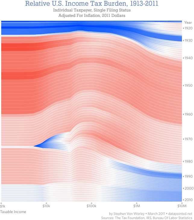
What I see in the graph is that those who make over $200,000 a year saw a sharp decline in tax in the 80s, which continues to today. There also is a blue blip for tax relief for those earning around $10,000, but that was gone by 1981. More red at the bottom of the chart would make more sense if the current deficit problem, or even critical infrastructure, is meant to be a shared burden.
A lack of constant color is the signal of inequality.
The government today thus leaves high income earners (blue on the right) with a lower share of taxes. While taxes are not high for most people today compared to prior levels, those who earn over $1 million now have the lowest burden of anyone relative to history. Those who earn $50,000 to $150,000 — the middle class — carry the highest burden.
The wave shape suggests to me that the middle class have been affected first by tax changes. It is a prediction wave. Their level of burden eventually spreads to higher and lower income levels…perhaps that’s what Stephen Von Worley meant by “until an angry mob”.
It’s true, more AFFLUENT voters tend to trend Republican. However, more EDUCATED voters tend to trend Democrat. You can’t call “poor, uneducated voters” the Democratic constituency, when because the GOP absolutely courts poor, uneducated voters.
The real GOP feat of the last ~40 years has been getting poor, uneducated people to vote against their own economic self interest by exploiting social issues. By sheer numbers, if they only actually expected rich people to vote for them, they’d never win a single election.
Honestly, I’ve thought for awhile that the smartest thing the Democratic party could do is to submit a budget that was the GOP wishlist.
Cut all the subsidies, cut the taxes, and let the population vote with it’s feet, let the the Democratic/Liberal states build their population base and let the GOP/Conservative states go broke.
It would suck for me personally (Indiana) but it would eventually break the back of the GOP.
Jonnan