Years ago I wrote about the secret history that lurks behind a famous American dessert.
Nobody else, at least to my knowledge, has been thinking and writing about the supply-chain vulnerability management required for America to promote itself as home of the banana split.
FEW-View™ is an online educational tool that helps U.S. residents and community leaders visualize their supply chains with an emphasis on food, energy, and water. This tool lets you see the hidden connections and benchmark your supply chain’s sustainability, security, and resilience.
FEW-View™ is developed by scientists at Northern Arizona University and at the Decision Theater® at Arizona State University. FEW-View™ is an initiative of the FEWSION™ project, a collaboration between scientists at over a dozen universities (https://fewsion.us/team/).
FEWSION™ was founded in 2016 by a grant from the INFEWS basic research program of the National Science Foundation (NSF) and the U.S. Department of Agriculture (USDA). The opinions expressed are those of the researchers, and not necessarily the funding agencies.
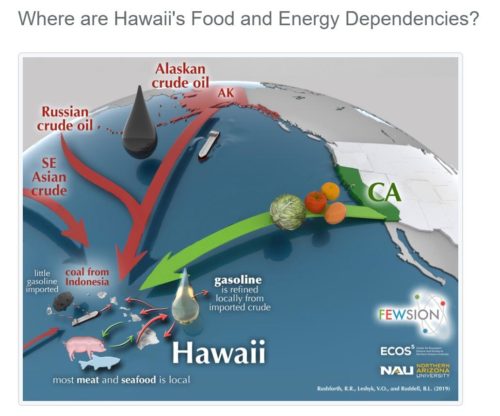
However, there are two problems I see already with the map. First, it doesn’t go backward in time. The illustrations would be far more useful if I could pivot through 1880 to 1980. Second, the interactive maps allow you to break out a booze category but I have yet to find a way to filter on bananas and pineapples let alone ingredients for three flavors of ice cream.
First a recent DARPA video shows how a swarm of drones would be carrying out an urban exercise:
Second, special operations describes their “future fights” training as assessing trustworthiness of partners in the field:
..instructors hear a gunshot echo in the woods. An extrajudicial killing ‘is obviously not ideal,’ one Special Forces instructor said.
Add these two together and you get special operators dropping into urban areas to identify and ultimately eliminate untrustworthy partners, which obviously means drones in the near future.
That pretty much sounds like the thesis of Blade Runner, which is finding presence of machines that lack empathy and then eliminating them. The tough question being, as the instructor said, is an assessment of imminent harm judicial or scientific enough to warrant hitting the off button?
For example, CVE-2019-0708 (Remote Desktop Services Remote Code Execution Vulnerability: May 14, 2019) has a EPSS threat score of 95.2% being exploited in the next 12 months, with a CVSS score of 9.8 (Critical).
That might be an obvious outcome, but it hopefully illustrates some of the importance in adding threat data to the vulnerability remediation timeline.
The real trick is finding CVSS that are low with EPSS that are high because that indicates a risk perception imbalance that quickly can lead to disaster.
On top of this advancement, consider also the riskquant tool recently released that does basic likelihood/severity mapping that probably has been debated in every disaster recovery planning audit meeting for the last 20 years let alone NIST SP 800-30.
…annualized loss is the mean magnitude averaged over the expected interval between events, which is roughly the inverse of the frequency (e.g. a frequency of 0.1 implies an event about every 10 years)…
Both tools are meant to help move from point scores of severity to trends of probabilistic likelihood and should be given a look sometime in the near future.
Some new analysis from the alliance for securing democracy shows how this all works. Their “Hamilton Dashboard” highlights two important findings in a post titled “Why the Jeffrey Epstein saga was the Russian government-funded media’s top story of 2019”
…few topics dominated the Russian government-funded media landscape quite like the arrest and subsequent suicide of billionaire financier and serial sex offender Jeffrey Epstein. In its year-end review, RT named the Epstein saga “2019’s major scandal,” and RT UK media personality George Galloway listed it as his number one “truth bomb” of the year (ahead of all the aforementioned events). Given the lack of any notable connection between Epstein and Russian interests, the focus on Epstein highlights the Kremlin’s clear prioritization of content meant to paint a negative image of the West rather than a positive image of Russia.
The first finding is a somewhat obvious one that Russia actively uses seeds that are meant to destroy positive imagery of the West (i.e. reverse the “Hope” campaigns that had resulted in President Obama). Epstein falls into this category.
The second finding is more subtle and implicit. Russia fails miserably to generate any positive image of itself. Every analysis I have read suggests Putin is both desperate and incompetent at forming a national identity, despite ruthlessly positioning himself as a long-term dictator with total control of all resources.
To put it in some context, Putin is a trained assassin, with little to no evidence he can develop a sense of national interest or ability to convey any leadership story about belonging. In fact, these two positions may be contradictory (inherent weakness of being an assassin) given how anyone forming greater identity and purpose would be assassinated; rise of identity could be seen as potential threat to the man with an artificially inflated sense of self worth above everyone else.
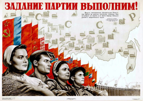
Anyway the graphic for the Hamilton Dashboard of the securing democracy site really caught my eye as a beautifully done rendition of the classic Soviet propaganda art that Putin seems incapable of achieving (a bit like doing the work for him):
The Hamilton 2.0 dashboard, a project of the Alliance for Securing Democracy at the German Marshall Fund of the United States, provides a summary analysis of the narratives and topics promoted by the Russian government and Russian state-funded media on Twitter, YouTube, broadcast television (RT), and state-sponsored news websites.
For comparison here’s some actual Soviet propaganda that celebrates creating a powerful aviation industry (a suspicious claim given staggering death tolls in their airline: in 1973 alone the Soviet aviation industry had 27 incidents and 780 people were killed)
This genre of “positive” spin poster of prosperity was backed by a complete suppression of any and all “unfavorable” communication that would challenge a progressive narrative (e.g. propaganda seeds of despair pushed by running a story about Epstein). Especially suppressed by the Russians were news of crimes against humanity (massacres, famines and energy/environmental disasters on Russian soil).
In other words, two diametrically opposed threads can be tracked in Cold War propaganda, posters of hope by the Soviets and counter-posters of despair by the CIA (the subject of Putin’s study while in the KGB).
Example of a Soviet poster pushing a positive narrative of prosperity from labor:
Map of the Soviet Union highlighting the contributions to the economy of its major cities and regions, each represented by symbols for dams, factories, mines, agriculture, and so on. Quoting Premier Nikolai Bulganin (served 1955-58). Source: Boston Rare Maps
Contrarian example of a CIA poster pushing negative narratives (indirectly via Italian media platforms) of demoralizing labor brutality:
A map flanked by long text notes describing the Gulag’s size — “if consolidated, would make a submerged empire the size of Western Europe” — and its staggering brutality, with an “average mortality rate… exceed[ing] 12% a year.” Source: Boston Rare Maps
In the modern context, being the typical self-promoting KGB agent trained in the art of copying everything the CIA did and trying to use it for his own gain, we see clear evidence in the Hamilton Dashboard that Putin is pushing a despair campaign using today’s social media platforms. He doesn’t, however, seem to be able to come up with any positive sense of identity for his own nation.
And I have to say, despite me being a student of these communication methods (even having a degree related to their usage) my attempts at art in this domain simply pale in comparison to what the Hamilton Dashboard has come up with.
Hats off to them…although really I would expect some despair in their graphic if they wanted to play this game right. I mean it seems a bit counter productive to gift the enemy with banner-level positive glorification imagery that everyone sees when they come to study the enemy.
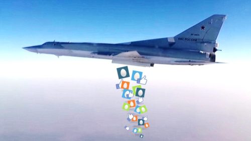
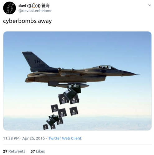
The same mistake probably should be said for me, in retrospect, as here’s my 2017 image that used to show up in many of my presentations:
“cyberbombs away” 2017
It was a refresh of the 2016 rendition that was even more snarky about the U.S. being way ahead in kinetic yet woefully behind in the more pressing cyber domain…
a blog about the poetry of information security, since 1995