
The US Centers for Disease Control and Prevention has a graphic of health risks as they spread from the East to the West over twenty years.
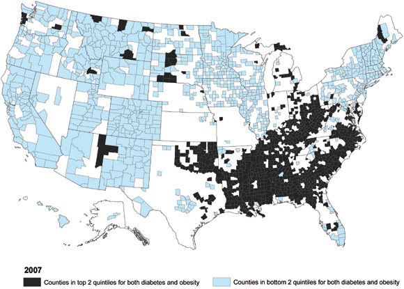
This image shows the overlay between diabetes and obesity:
The CDC also discuss the correlation between obesity and exercise, which discusses how a caloric intake higher than a metabolic rate is a major factor.
Americans who live in Appalachia and the South are the least likely to be physically active in their leisure time. In many counties in that region, more than 29 percent of adults reported getting no physical activity other than at their regular job.
Unfortunately they do not yet have a graphic that maps specific types of food product consumption rates and change (e.g. soft drinks or even just corn syrup) to obesity. Another interesting overlay would be the density of fast-food restaurants and supermarkets relative to obesity. And another one might be the percentage of cars relative to bicycles to obesity.