The i2group promotes themselves as a way to “investigate, predict, prevent and disrupt the world’s most sophisticated criminal and terrorist threats”. That sounds very interesting. They have a product called the Intelligence-Led Operations Platform or ILOP that recently earned them the “Queens Award for Enterprise Innovation”:
Introduced in May 2009, i2’s integrated Intelligence-Led Operations Platform delivers an integrated set of powerful analysis, visualisation and management applications built to identify hidden connections and patterns from disparate data sources.
The tool is able to draw a very rudimentary two-dimensional diagram of connections between events and actors. It might sound familiar because it is the sort of thing used in social science called concept mapping.
Here is an example from i2 of what you can expect from the “Analyst’s Notebook” of the NYC Times Square attack:
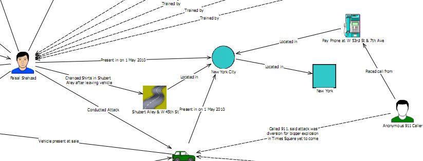
I see a 911 call from an anonymous actor in the diagram, but the only mention of the street vendor is in the timeline at the bottom of the diagram. Interesting to note it was a report from a vendor on the street that played a significant part of this story in the press.
Street vendor Aliou Niasse was the first to spot the car containing the Times Square bomb, which pulled up in front of his cart last Saturday. Niasse, a Muslim originally from Senegal, said: “I didn’t see the car pull up ..because I was busy with customers. But when I looked up I saw that smoke appeared to be coming from the car.” Niasse went on: “I thought I should call 911, but my English is not very good…so I walked over to Lance, who has the T-shirt stall next to mine, and told him. Immediately he alerted a police officer near by.”
This has led some to write that street vendors are the actual first line of defense. Why the vendor does not show up in the link analysis is hard to say. The links on the far left of the original chart, by comparison, shows “15 bags of fertilizer –> Discovered by Investigators at –> Private residence, Long Hill Ave”.
That would be my first concern with this example by i2 and their software. It seems to be manually entered and therefore subject to interpretation. One of the most important areas of the actual process that led to the arrest of a terrorist is omitted. Someone who looks at their chart might believe that this is automated or even impartial because it uses a computer program. However, it looks like a visio diagram could do as well or even better. Paper and pen would give it a run for the money as well.
My second concern expands upon this point. The pdf has an IntelCenter samurai-looking logo and says it comes from the Terrorist & Rebel Link Analysis Feed (TR-LAF). I have not used the program so I am guessing here but is there an actual feed of data that goes into this program? Does it monitor all law enforcement communication across all the agencies, find 15 bags of fertilizer that matches and automatically draw links? That sounds powerful, almost like what Cyveillance used to talk about. It also sounds too good to be true. Based on the primitive output in the chart, and the age of the company, I suspect it has a long way to go before it is providing automation.
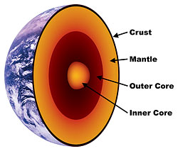
The third concern I have is that it is 2D and splits the timeline into a separate area. Perhaps that is because it is a PDF, but I assume this is what the screen shows users as well. It would be far more useful if a 3D chart were available, like the attack visualization engine in Sourcefire, which included a replay/time mode. The chart would grow and links would form, in other words, as time passed. Converting this to a PDF would show lines that linked events over time to spheres of growth in the 3D chart. Perhaps something like this: