
Only a day or so ago I posted a list of coronavirus maps. Within 24 hours of that post, some maps changed dramatically.
The worst map (CDC) became marginally better, while the best map (nCoV2019.live) wiped its details and suddenly became one of the worst.
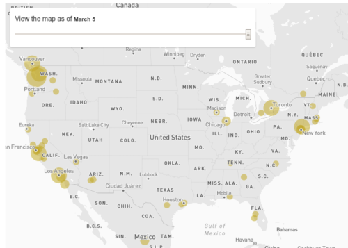
Neither of those changes probably mattered to most people as the one I keep hearing about from people is the Johns Hopkins CCSE, which I already warned had problems. It’s now March 5th, do you see a problem with this map?
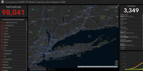
Here’s a big clue about this empty view of New York: news stories running at the same time offer some very precise numbers that should be visible.
New York’s race to quarantine thousands of people potentially exposed to coronavirus is testing the limits of public health responses to the COVID-19 outbreak spreading across the U.S., experts said. In a matter of 48 hours, what began as one Westchester County man’s COVID-19 infection spiraled into a community quarantine disrupting countless lives [as] …disease detectives worked to track the movements of 22 confirmed cases in New York so far, authorities said Thursday.
My next step was to search for anyone reporting this in their bug tracker (nope) and then dump the Johns Hopkins CSSE map raw data. They make it available as a daily CSV.
Their data clearly has 23 cases for NY, based on a simple query.
![]()
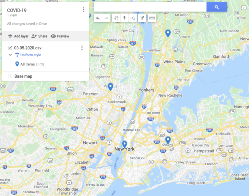
Then I loaded their raw data into a generic Google map and here you can see the pins show up where there were none in the Johns Hopkins map:
Unless I can find someone else reporting this, I will have to file the bug. However, it also seems kind of pointless when newer and better maps are emerging.
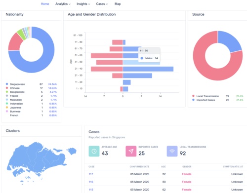
There is nobody in the world doing a better job than Singapore right now, for example. Their Kibana-looking co.vid19.sg dashboard is phenomenally useful, with graphs of demographics as well as geolocation over time (spread).
It can be frustrating after seeing this to look at other sites and find similar demographic details missing, such as in the Hong Kong map.
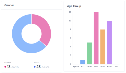
One thing that really popped out for me in the Singapore data, to be clear, is how the virus spreads without symptoms and has predominantly hit men older than 18 and is disabling them for a week or two.
That combination of factors are so eerily similar to historic bio-weapon research objectives (years ago I often gave talks about Cold War attempts to weaponize rabbit-flu, and it’s in my new book about big data security)… so I’ll just say here it’s hard to not to call out the military and political implications of what the data is revealing.
For perspective, I’ve been writing pandemic response policies for years, as a function of business continuity, and the FEMA definitions that were recommended to trigger a policy used to be “…30 percent or higher in the overall population during the pandemic. Illness rates will be highest among school-aged children (about 40 percent) and decline with age…”.
In related news, either Russia is blind or they really have only 3 or 4 confirmed cases so far (according to maps by WHO, EU, Virginia, Kaiser, Esri/ArcGIS, Healthmap, and Worldometers).
Given the healthcare crisis in Russia and reports of a 75% drop in available health facilities between 2005 and 2013, such that only 20% of the population even has healthcare… I’m going to guess they’re completely blind.
Back to speaking about maps with geolocation over time, I also just noticed that NY itself has launched a great map called the NYDatabases.com site by Ithaca Journal
Unsurprisingly it gives the best representation so far of the situation in NY. My only issue is the bland color theme that makes it hard to see any hot spots on zoom. That’s still an error in my book, but I’ll gladly take a quick theme adjustment over data never making it to the map.
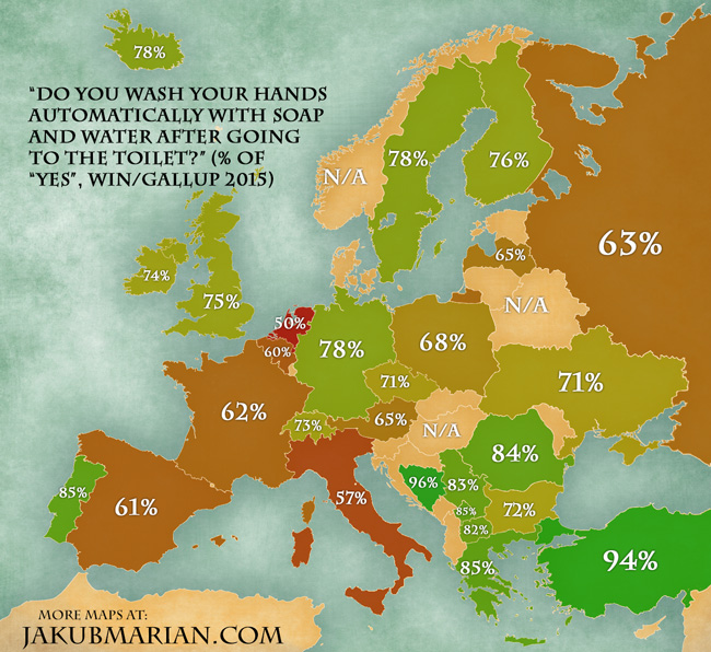
One thing I haven’t see anyone do yet, despite hand-washing frequency at the top of mind, is represent counter-measures in virus maps. Closest thing so far is a 2015 survey showing Italians near bottom of the list.
ok, i’ll take the bait. you hint at a demographic profile that means we should be thinking of this as a bio-weapon. so, should we?
@chicken little, sorry if I implied too much. i will try to clarify in three points:
1) there is no evidence this is a bio-weapon case.
2) despite no evidence, it still makes sense to think about it relative to bio-weapon research only so far as it’s doing what bio-weapon researchers hope they can do. again there’s no evidence of it being a weapon, only that it surely inspires those aspiring to make weapons and defend against them.
3) a lot of the noise about evidence of conspiracy or some military intent can be explained by better analysis. for example, why do so many chinese die? it affects the lungs and the chinese have been heavy smokers and subjected to terrible air pollution for a very long time. another example, why are there no cases in russia and so few in india? i covered this a little above. like most dictatorships or fascist states there’s no healthcare system and russia hates science/reporting. we are seeing a similar attitude in the US white house, where statements are made about intentionally corrupting the case number reports to make a weak leader look strong. india is reporting spread (34 so far) and also taking extraordinary measures like dedicated ambulances for suspected cases, so i think you’ll see their numbers go up but also their state healthcare countermeasures be more dynamic and measured. as a final thought, warmer and humid climate definitely plays a factor in transmission but scientists are still challenged to explain how far and how long a virus ‘droplet’ is contagious; the latest evidence is as far as 15 feet away and for several days.