
Regular readers of this blog may remember when I raged about the “statistical mess” reported in the news when it comes to which mobile phone is “winning”. That was a couple months ago (or six decades in mobile years).
Reuters, for example, headlines with “Google’s Android takes lead in US consumer smartphones: Android devices had 33 pct share in Q2”. Open the article, however, and you you see that they compare Android to RIM. That is like comparing Linux to Apple Laptop sales. One is an operating system, the other is hardware with an operating system.
This time I went straight to the source and found Nielson is actually reporting three phone OS trends. No hardware and software mixing and such, thank you very much.
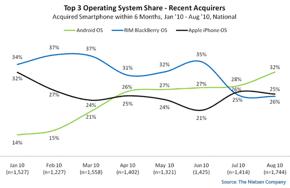
The chart makes it tempting to call RIM the biggest OS loser, but in fact it starts the year two points ahead of Apple’s OS and then ends the year…wait a minute! Does that chart say 25% is higher than 26%? WTF?
I swear I did not edit that image. Nielsen currently tells the public that the Apple’s iPhone OS or iOS (they seem to make it interchangeable) has leaped ahead of RIM’s OS with 25 points, while of RIM’s OS trails behind at a sad 26 points.
A mistake, surely. The Nielsen blog text gives another view:
…Blackberry RIM and Apple iOS are in a statistical dead heat for second place among recent acquirers
The next graph shows Google’s Android OS gaining ten points in just six months while RIM’s OS lost five and Apple’s iOS lost one.
Android is now only ten points behind iOS. Can they keep up the pace and pass iOS in the next six months? Looks clear to me that Google will rocket past Apple:

Will people dump Apple’s iOS because of hardware lock and privacy concerns only to find Google’s Android OS is playing from the same deck of cards? These are questions I wish Nielsen had tried to answer.
I also wish they had mentioned the Symbian OS. Nielsen omits its trends entirely, which gives me the impression the data has serious geographical bias — Apple-merica. The iOS and Android, in other words, would be lower, maybe significantly lower, than BlackBerry OS and Symbian if this were a global test.
The BBC chart I mentioned before was confusing, but it still paints a more complete picture than Nielsen.
No, it doesn’t say 25 is above 26.. It is confusing, but RIM numbers are consistently above the line, and iOS is consistently below. The 25 is talking about RIM which is the lower line.
Perhaps bad design, if they colored the numbers in the chart or omitted them it would be less confusing.
It would also be enlightening if Nielsen put an AXIS on their chart … the thing looks hand-drawn with significant wobble in the placement of the same value as you move across the chart.
Steve, thanks, your explanation makes sense but the chart is visually hard to support. 25 above 26 becomes the focal point and it looks wrong.