An academic trawl of the corporation’s archives has revealed that while the Nazi regime used puppet broadcasters such as William Joyce – nicknamed Lord Haw-Haw – to spin messages of German invincibility, the BBC was choosing to broadcast detailed news of Britain’s military setbacks. The decision was part of a deliberate strategy to win the hearts and minds of the German people, says Dr Vike Martina Plock of the department of English at Exeter University, who discovered memos from the time during research at the BBC Written Archives Centre in Caversham Park, Reading.
The strategy was simple.
If the Allies could openly admit defeats, it was believed [by Nazi listeners], they must be extremely confident, convinced of their eventual victory over Nazi Germany.
Tales of invincibility projects weakness, whereas confidence comes through when talking openly about losses.
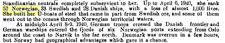
For instance, on 27 November 1942 the service reported on the bombing of Toulon by the Germans and the scuttling of the French fleet by Allied forces to avoid capture by the Nazis. The invasion of Norway was covered with similar attention to detail. On 6 April 1940, days before the invasion the BBC German Service accordingly told listeners that the German navy had sunk 52 Norwegian ships causing the death of 392 people.
The BBC referred to themselves as “The Fourth Arm” of warfare and some of it still can be reviewed in their archives.
Source: BBC Genome
Here’s the kind of honesty in British reporting the Germans reoriented themselves towards:
Source: Indian Annual Register, Volume 1, 1945, page 253
On the flip side, opposite to the examples of truth telling, are all the “spin” stories such as the giant fiction of Rommel being anything but a selfish hack, who I’ve written about before.
A couple years after his failures in North Africa and Europe he was coerced into suicide by state threats to kill his entire family, covered up by propaganda claiming he died from battle wounds.
Rommel’s reputation obviously was artificially inflated during and after his life. This despite massive failures and pathetically supporting Hitler all the way to taking a poison pill to prove he remained loyal to the lies of fascism. Rommel literally said in his final days that the coming occupation (a period of truth-telling) wouldn’t suit him.
Hitler then demanded Rommel commit suicide or be forced to watch all his family and contacts be gunned down first before being executed; his chief of staff and commanding officer already executed by Hitler.
And in that context of the liars going to the grave rather than try to live a truth, we must also not forget “Lord Haw-Haw” was in the end held responsible for his Nazi “spin” broadcasts.
4 January 1946: William Joyce, known as Lord Haw-Haw, who started his Nazi propaganda broadcasts with ‘Germany calling,’ is executed for treason.
It was a similar fate for another Nazi “spin” broadcaster, Paul Ferdonnet from France, also who I’ve written about before.
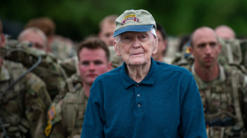
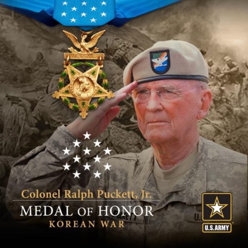
The news right now is about a widely respected and beloved leader in the US Military achieving the highest award for valor.
70 years after the battle of Hill 205, November 25, 1950; Ralph Puckett at 95 years old is to be upgraded to the Medal of Honor.
Source: ArmyTimes. “Retired U.S. Army Col. Ralph Puckett stands alongside troops as they prepare to start a foot march during the 2021 David E. Grange Jr. Best Ranger Competition on Fort Benning, Ga., April 16.” (Sgt. Henry Villarama/Army)
Yet I can’t help but notice an important side-story.
In “Witness to War” Puckett clearly is using his current platform to point out (in a gripping combat story) what a terrible leader General MacArthur was.
General MacArthur had seen Truman the 8th of October and told the President the Chinese are not coming into North Korea… he obviously was wrong about that […] I just couldn’t understand why things appeared to be easy to MacArthur.
This has to mean something big. Puckett is very purposefully throwing MacArthur into the dustbin of history, as any literate historian would too.
…historians have reassessed Douglas MacArthur—not just his command style, but particular decisions he made, and particular episodes from his long and controversial career. In modern evaluations, more often than not, “Dugout Doug” comes up short. […]
How did MacArthur blunder so badly? How could he miss more than 300,000 Chinese soldiers? Once the intelligence finally came in loud and clear, he and his staff of sycophants continued to dismiss it, suppress it, or willfully misinterpret its import. In so doing, they recklessly put tens of thousands of American and other United Nations troops in mortal danger. The result was catastrophic: One of the worst defeats, and one of the most ignominious withdrawals, in American military history.
It was, in some senses, a repeat of his debacle at Bataan. Only in this case, MacArthur had been outwitted and outflanked by a guerrilla army with no air force, crude logistics, and primitive communications, an army with no tanks and precious little artillery. As David Halberstam put it, MacArthur had “lost face not just before the entire world, but before his own troops, and perhaps most important of all, before himself.”
All of this happened because MacArthur was almost criminally out of touch with reality.
I can feel the bitterness in tone when Puckett speaks to the camera about the 8th of October tension of 1950 between MacArthur and Truman, in an otherwise completely neutral and factual retelling of a near-death battle.
Here’s how it was reported to the public around the time Puckett was on the ground thinking MacArthur was dangerously clueless.
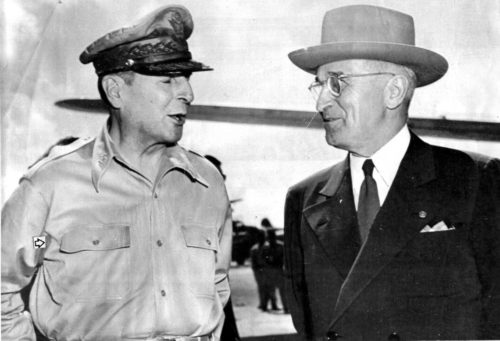
Truman fired MacArthur in April 1951 for disobeying orders. Truman surely regretted not firing him sooner.
“I didn’t fire him because he was a dumb son of a bitch, although he was,” Truman later said. “I fired him because he wouldn’t respect authority…”
The Medal of Honor for valor in the Korean War really gives us a chance to listen to a detailed retelling of American history from a soldier who by all accounts has the highest integrity, who is neutral in tone and ultimately who makes others perform better… and who is clearly pointing out MacArthur was a clueless disaster.
Reminds me of the Trump family repeatedly invoking MacArthur as their hero for being a “not nice guy”. I am pretty sure they mean the same sort of thing that historians might refer to as MacArthur’s extremist evangelical white supremacist beliefs.
As late as 1950 [MacArthur] commented to a visiting American churchman: “Please send ten missionaries for every one you now have in Japan. We must have ten thousand Christian missionaries and a million Bibles to complete the occupation of this land.” […] MacArthur’s conviction that democracy and Christianity were inseparable necessities for the rebirth of Japan was readily accepted by many chaplains.
Another fun history fact is — since we’re talking about MacArthur’s “not nice” evangelical views — that the Aryan Nations white supremacist domestic terrorist group was inspired by Colonel William Potter Gale (a close aide to MacArthur who also was a “Christian Identity” pastor).
Gale spent his time after WWII back in America to spread what the SPLC calls “a militia-type antigovernment movement that promoted racist and anti-Semitic views.”
Just to emphasize the point one more time… “MacArthur was almost criminally out of touch with reality” and his incompetence helped spawn veteran-led violent Christian domestic terrorist groups in America.
And that reminds me of a bunch of obviously clueless American flag officers who just published a completely tone-deaf fear-mongering disinformation letter (or as Steven Metz, professor at the US Army War College, called the letter: “unhinged, delusional and, frankly, stupid”).
Think carefully about all this in comparison to the typical caption of this photo…
“Probably one of the most unpopular of Harry Truman’s moves during his seven years and nine months as president was the firing of Gen. Douglas MacArthur. But Truman never publicly wavered in the belief that he did the right thing. Here Truman and MacArthur meet on Wake island, Oct. 1950.” Source: UPI
Truman was right and probably should have fired MacArthur sooner.
I’m certain Retired U.S. Army Col. Ralph Puckett would agree.
Though the Army had only been desegregated by President Harry Truman two years prior, Lt. Puckett selected two African Americans to serve in the 8th Army Ranger company. Why? Because they met the standards and to quote, ‘we were all Americans, the blood was the same color: red,’ Lock said on a call with reporters ahead of Friday’s ceremony, adding he later did the same for women.
Puckett was everything that General MacArthur was not, and America is hopefully at long last able and willing to recognize the significant differences. Puckett now becomes the oldest Medal of Honor Recipient, as Charles Coolidge (June 18, 1945 award) very recently passed away at 99.
It’s a completely bogus framework of law designed to promote wealthy white car ownership, and moreover normalize racist violence against non-motorists.
Texas is a fourth-world country that likes to hurt people, and is more proud of its legacy of slavery (“Remember the Alamo”) or hate doctrines (“Lone Star”) than anything else.
Put these two things together and… color me surprised that the notoriously tyrannical College Station police within the backwards state of Texas were just caught on film being obvious thugs and bullies.
In Texas they simply don’t care.
Was the cyclist riding around where nobody was at risk somehow posing a risk? There’s no risk and the cyclist keeps asking “for what?”
If the police don’t care, they don’t care. Eventually the police said there was a minor traffic violation.
In other words, can you believe Texas police actually were concerned with anyone’s safety? The video shows police treating a cyclist as convenient punching bag and target for their itchy fingers… with no evidence of threat.
Even the wider context doesn’t help change this narrative. The police themselves say they just wanted to prove a point by hurting the cyclist because he didn’t “obey” them.
The Texas police literally crashed (dropped their bike) without justification and then claimed falsely that they were most concerned with stopping crashes.
Police said at 1:04 p.m. the bicyclist was seen running through a red light at University and Nagle Street.
In other words, a cyclist rode in a manner the police disliked and didn’t seem to take their anger seriously. To force him to respect their authority to continue enforcing pointless and racist laws, then they did the dumbest thing possible and perhaps lost all respect.
There are many rational SAFETY-BASED reasons for cyclists to both ride through red lights as well as “jaywalk”.
Two thirds of bike commuters run red lights: “…three main reasons: the need to turn, the failure of a signal to recognize them at an intersection, and the absence of others on the road…”
“I treat red lights and stop signs as if they were yield signs. A fundamental concern of ethics is the effect of our actions on others. My actions harm no one.”
Logically (ethically) and historically the cyclist already was on more firm ground than the police, and then a pointless violent assault removed the moral standing police obviously thought they deserved.
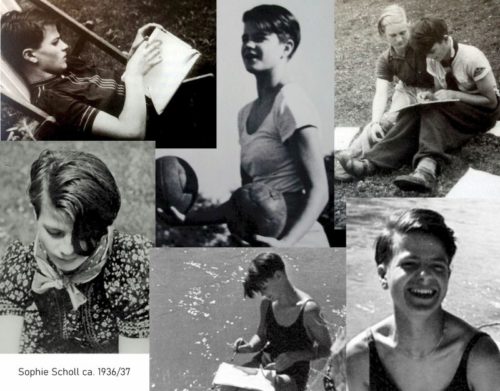
On the 22nd of February 1943 a brave 21-year-old woman walked to a Nazi guillotine, displaying full conviction she “had done the best I could have done for my people”.
This is where her life ended. But how did it begin?
Today marks what would have been the 100th birthday of Sophie Scholl. On May 9th, 1921 her protestant liberal German parents had their fourth child, who grew interested in art and music.
Like all “eligible” German children she was forced to endure indoctrination from the “Hitler Youth” program. The Nazi system of hate was designed to stomp children into becoming obedient followers of a fascist regime of ruthless intolerance, and to rebel against their parents.
Sophie, as might be expected of such heavy propaganda, at first participated in regular programmed camaraderie and adventures. She became a squad leader of the Nazi Bund Deutscher Mädel (League of German Girls), where they were trained to sing songs like this one.
Läutet, daß blutig die Seile sich röten,
Rings lauter Brennen und Martern und Töten
(Ringing, until ropes run red with blood,
Ring louder with burning, torture and murder)
Then her loyalty and intelligence began to take effect. Major doubts arose: Why were her friends denied membership for being Jewish? Why were books mysteriously forbidden from any discussion with her own squad? Why were women being denied any future except “wife, mother, and homemaker”?
Her older brother Hans was arrested in 1936 when he crossed one of these invisible lines of secret police, accused of being in a forbidden youth movement (Deutsche Jungenschaft, Bündische Jugend — basically the Boy Scouts).
It was this arrest of her brother that turned Sophie as a 15 year old girl away from Nazism — she felt loyalty to her family and to human values more than the irrational hate programming.
Six years later in 1942 Sophie joined her brother Hans at Munich university, where he already had been active in a group called The White Rose that opposed German fascism.
Sophie then convinced her fiancee — a 25-year-old law student and officer in the Nazi air force named Fritz Hartnagel — to also support the resistance group.
On the 23rd January 1943, just a month before The White Rose was uncovered and Sophie would be executed, Hartnagel returned to Germany on the last military evacuation plane out of Stalingrad. Dutiful as a Nazi officer, yet supportive of Sophie in The White Rose, he survived the war and died in 2001 at age 84.
Today she is considered one of the most important Germans of all time.
a blog about the poetry of information security, since 1995