
I’ve written several times about big data and visualization issues for the COVID-19 pandemic.
- March 3: Visualizing Coronavirus Spread: Many Tools, Results Vary Widely
- March 8: America Admits to Cooking its Numbers on Coronavirus
- March 11: Why Big Data Missed Early Warning Signs of COVID-19
As a long-time researcher of big data security, the most important problem space always has been one of data integrity, no matter how many times the market tries to shift everyone’s focus onto confidentiality (encryption, encryption, encryption).
Why do we care about data integrity here, or more specifically about test results on a dashboard? A recent Guardian article explains the significance with a simple metaphor to tell us how badly the White House is mismanaging security science:
Trying to combat the disease without testing is like running through a forest blindfolded – it’s not going to end well.
I would only add to that we’re entering a situation where we don’t control the running part, a virus does. The speed of movement is more like being caught in an avalanche and there’s a quote that always runs through my mind when I’m on steep terrain in deep snow:
…sparse trees do nothing but provide things for you to hit as you’re swept away.
First, the Worst.
America’s CDC has one of the worst, if not the worst, dashboard in the world. I’m embarrassed to even post it here. Don’t look. It’s pointless. Until they figure out that Alaska is part of the US, I’ve given up even trying to rationalize how badly CDC is doing.
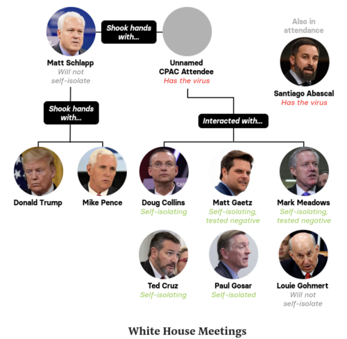
Instead, I offer you a visualization by Buzzfeed News of small data about the White House itself, which shows spread of the virus due to obvious failure in leadership (lack of proactive distancing and testing).
Next, an honorable mention in this worst category is the much celebrated Johns Hopkins University dashboard. A good attempt, yet perhaps a dangerous lesson in failures.
It sadly appears to be broken and untrustworthy while being heavily cited as a success. In the three links at the start of this blog I’ve warned about their issues before (e.g. with everyone predicting NYC being a hot spot yet their map failing to represent growing cases). I also just noticed there’s a site that depends heavily on the dashboard, which now carries a very disturbing warning at the top.
Johns Hopkins university, the source of almost all of the charts, maps and tables below, is currently experiencing technical issues. The visualizations that show cases in the US, in China and worldwide over time are therefore incorrect. If you’re using them in your articles, please inform your readers about the issue.
Dear reader (hi mom!) consider yourself informed… again.
To be fair it’s a little unfair to call it the John’s Hopkins University dashboard when a graduate student (Ensheng Dong) built it for (or with) Lauren Gardner, Professor of civil and systems engineering.
Also I have to give a shout out to Splunk. They tend to be known for over-priced proprietary data quicksand, yet they’ve very nicely announced removing their usual red flags by offering an app via github for COVID-19 data.
While we will continue to expand our app and add features, we understand that others have their own ideas of how to visualize this data. Feel free to clone this app and create your own version, or get in touch with us… to collaborate and submit data and visualizations that you think others may find useful in the publicly available app.
There’s just a little problem. Can you understand this chart?
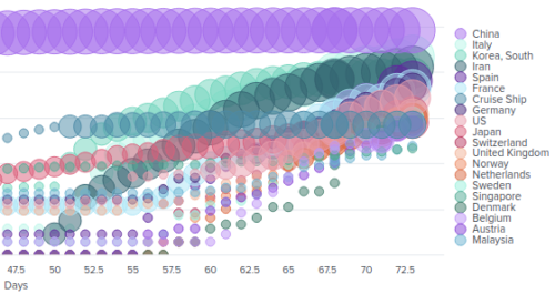
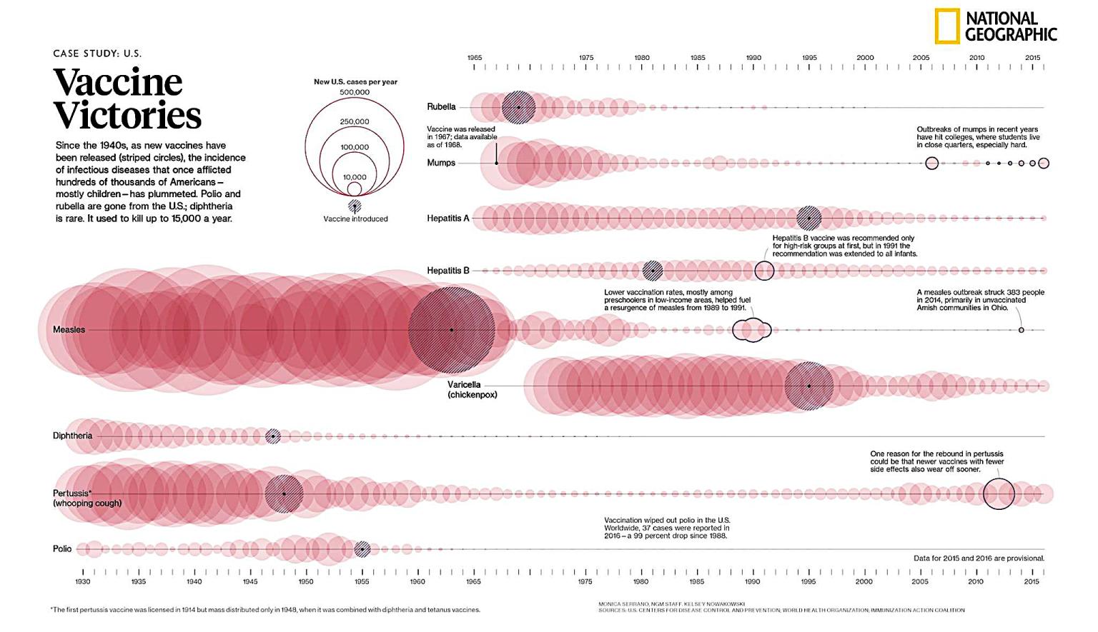
It reminds me of this old National Geographic chart of “Vaccine Victories” but gone completely wrong.
Hate to be cynical in the face of a gift horse, yet that default visualization for a flagship dashboard is so illegible… no wonder they’re giving it away and asking for community to do better. It just maybe is why they’re pushing the general public to post ideas so they can then commercialize it and make money off pandemic volunteers. I know, too cynical.
By the way, does anyone really want to use “Day 62.5” in a chart?
Second, the Best.
Singapore is unquestionably the best national site. It baffles me why the US federal government couldn’t grab Kibana and put this together in a week at most.
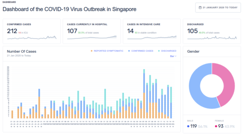
The first cases come around January 20th and growth is contained. It’s all very easy to see, and they offer numerous ways to pivot the data by demographics and region over time. It’s so good, I just imagine a competent White House would have had a same or better one by end of January at the latest.
On a more local level, and also in the US, Washington State Hospital Association has posted a fascinating new map by Albert Froling using Tableau.
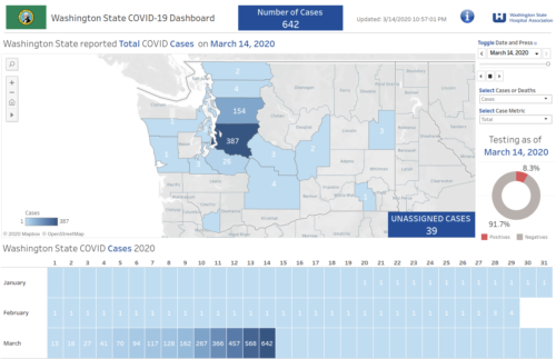
The “testings” donut on the lower right is my favorite widget, although it tells us 8% of tests are positive when we really should want to know what percentage of the total population has been tested and when. Anyway, the whole thing feels masterful after playing with so many bad examples.
Meanwhile the White House is attacking Washington state leaders using cheap name-calling and jealous taunts.
In remarks that many found confounding and frightening, [White House occupant] described the governor of Washington state as a “snake”, praised his own expertise and falsely claimed that anyone who wants a coronavirus test can get one. Pence was later forced to correct this.
It only stands to reason that the federal and Washington state visualizations of virus test results are complete opposite ends of the spectrum.
Third, the Tactical.
Washington Post has done a great job capturing and applying the classic contagion lessons of big data visualizations.
They’ve taken the vaccination simulations, everyone knows all too well in visualization templates and games to learn from, and made an extremely useful point about why social distancing action was needed immediately after the first cases were confirmed.
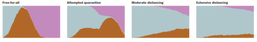
Perhaps even more importantly the above illustration shows why quarantines aren’t as effective as social distancing.
The same article shows Jan 21 was the first confirmed case and distancing wasn’t started, tests were not being done at scale, due to sheer incompetence of US government leadership. Hundreds of thousands of Americans are likely to die based on unnecessary delays and indecision by the White House.
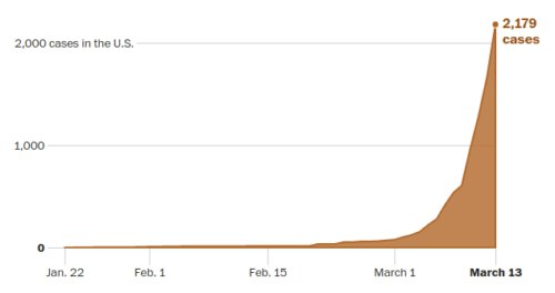
Let’s be honest here, it’s March 14 and tests still are not done at scale. The White House only started to actually pay attention after financial markets reacted to the White House lack of reaction and everything crashed; by then it was far too late to turn back the clock and start effective early virus response. It’s such a tragedy to see very clearly in the visualization here how an easily predictable and well known exponential curve was ignored until too late.
The Washington Post sends a warning simply and clearly:
If the number of cases would continue to double every three days, there would be about a hundred million cases in the United States by May. That is math, not prophecy.
China is right now counting about 81,000 cases, for perspective.
Now let’s go back up and marvel again at how math is driving the Singapore dashboard, and the very clear and transparent fact that they have a flat line instead of an exponential curve.
Update March 15: I’ve been asked to list some of the other sites considered, beyond those already mentioned in the previous blog posts (e.g. NYT, Hong Kong). Here is a short-list for review. Let me know if you agree or disagree with my worst/best results.
- ArcGIS
- World Health Organization (WHO) map of EU
- United Nations World Food Program (UN-WFP) map of Italy
- J.A.G map of Japan
- Thailand Ministry of Public Health
- UK Dept of Health and Social Care
- ESRI maps of Germany, Korea, Portugal and Spain
- ESRI map of Macau
- Philippines Dept of Public Health
- Tableau “quick start dashboard“
Duly informed. Again.